grn.dk — design directions
Every page is a full front page built from the site's real content (today's article, the published cases, the price list, the review). Open any of them and use the switcher bottom-right to flip between all eight. Desktop and mobile both work.
This is the live site now. Design 6 “Personal” shipped as grn.dk’s theme in September 2026 — see it live.
Round 2 — after the feedback (10 Sep)
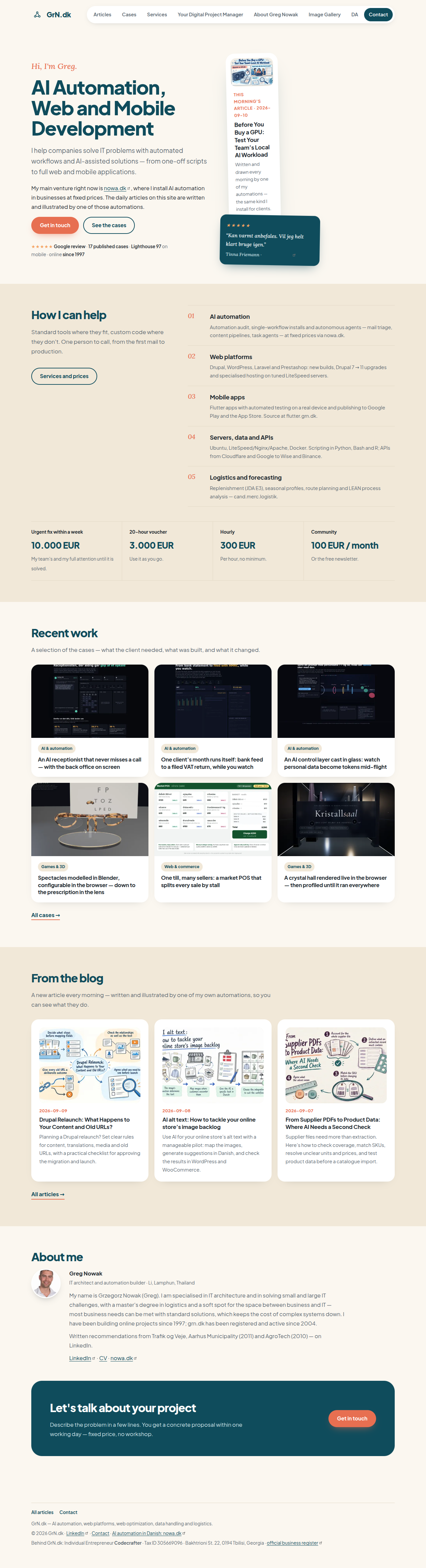
- 6 keeps Personal and takes the portrait out of the hero — this morning's hand-drawn article stands there instead.
- 7 keeps Showcase and lets you switch the headline font on the page (bottom-left picker; the URL records your choice).
- 8 keeps Sister's structure but gives the page a focal point: the live article panel, one big case, a dark price band, lists instead of card rows.
Personal, no portrait
Design 5 with the photo out of the heroFonts: Plus Jakarta Sans + Lora
Palette: cream and sand, deep teal, coral accent
What changed: The portrait leaves the hero; this morning's hand-drawn article takes its place, with the review beside it. The icon-card rows (trust, services, prices) become plain lists so the page reads less like a template.
The warm consultant page, carried by the daily illustrated article instead of a face.
Showcase, new headline
Design 4 with another headline font — pick it liveFonts: Archivo (default) · Inter Tight · Bricolage Grotesque · Syne · Anton · Instrument Serif, + Inter
Palette: black / white, signal orange
What changed: Space Grotesk is gone. A picker bottom-left switches the headline font and upper/lower case on the page, and the URL records the choice so you can send back the exact combination.
Same bold portfolio; you choose the voice of the headline.
Sister, with edge
Design 2, less even, more pictureFonts: Inter
Palette: white, emerald, one deep-green band
What changed: The hero gets today's illustrated article as a live panel; cases run as one large plus four small instead of six equal cards; services become a numbered index, prices a dark band. No stat row, no eyebrow pill.
Still the nowa.dk family and still an Olivero sub-theme, but with a front page that has a focal point.

Design 7, the same hero with each of the six headline fonts. Open 7 and pick one live; the picker also switches upper/lower case.
Round 1 — the original five (9 Sep)
Kept for reference; the switcher still reaches them.
Current site (for reference)
Stock Drupal Olivero with an emerald brand layer (August 2026): long single column, right rail of article teasers, page title bar, header block.
Studio
Editorial paper — the daily article is the front pageFonts: Fraunces + Source Sans 3
Palette: warm paper, near-black ink, muted emerald accent
Leans into the site's real strength: a new illustrated article every day. Reads like a journal, not a CMS.
Sister
The nowa.dk system, in emeraldFonts: Inter
Palette: white / light-grey bands, emerald primary
Same structure and rhythm as nowa.dk so the two sites read as one family; the safest, fastest to build.
Terminal
Dark engineering shellFonts: JetBrains Mono + Manrope
Palette: charcoal, mint accent, hairline panels
Says 'serious engineering shop' at a glance; cases as systems in production. Article pages stay light for reading.
Showcase
Bold agency portfolio, one signal colourFonts: Space Grotesk + Inter
Palette: black / white, signal orange (deliberately not green)
Biggest departure: oversized type, full-bleed case imagery, numbered work. Tests whether green should stay at all.
Personal
Warm consultant, photo firstFonts: Plus Jakarta Sans + Lora
Palette: cream and sand, deep teal, coral accent
You are the product: face, review and recommendations up top, rounded and friendly. Built for 'hire me'.